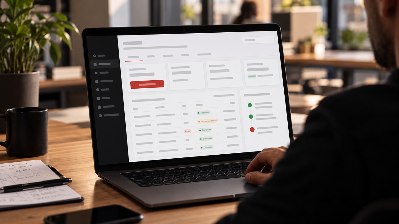
Partner Campus Platform · Product Design
When money isn't clear, the relationship wears down too.
I redesigned the financial experience of a B2B education management platform to bring more transparency to payouts, more autonomy to partners and more clarity to financial transactions.
Product Designer · End-to-end
About the project
- Product
- Partner campus management platform
- Platform
- Web
- Discipline
- End-to-end Product Design
- Context
- B2B · EdTech
- Status
- Shipped
Confidentiality note: Some institutional information has been generalised for confidentiality reasons.
01Context and problem
The figures were there to look up. Understanding them was another story.
The web platform was used by managers of partner education campuses, their staff and professionals across a network of educational institutions. It handled enrolments, student management, campus registration, exam scheduling — and finances.
This case covers the financial experience only: it was spread across different features, with a poor statement table and information that was hard to interpret.
Where the experience broke down
- 01A confusing statementHard to follow what came in and what went out.
- 02Scattered featuresFinancial tasks were spread across the system.
- 03Payouts hard to readIt wasn't easy to see how the amounts were reached.
- 04Unclear deductionsLittle clarity on the deductions applied to the amounts.
- 05Reversals without contextReversals from student-related operations could make the amounts harder to understand.
- 06Inefficient disputesDisputing a discrepancy was an inefficient process.
- 07Little flexibilityPayouts followed a rigid release schedule.
These difficulties bred mistrust and strained the relationship between the campuses and the institution.
Recurring complaints were among the signals that helped frame the problem.
In a financial relationship, making information available isn't enough.It has to be understandable, traceable and useful for making decisions.
02Product Discovery
Understanding the operation before redesigning the interface.
I ran discovery with both sides of the relationship, to understand what the campuses needed and what the institution had to preserve.
How the operation was understood
- 01Interviews with partner campus representatives
- 02Stakeholder alignment sessions with the institution
- 03Financial journey mapping
- 04User needs gathering
- 05Analysis of recurring complaints
- 06Business rules and operational constraints
Two perspectives to balance
Partner campuses
- Understand the amounts received
- Dispute discrepancies
- Manage their own cash flow better
The institution
- Keep its financial rules
- Preserve its controls
- Maintain its approval processes
The difficulty wasn't limited to how the figures were displayed.The whole experience made it hard to understand what had happened, what was still pending and when the money would be available.
03The design decision
What if managing a campus's finances worked like a bank?
Instead of teaching a new logic, we used one people already knew.
The idea was to structure the experience around a mental model partners already used every day, so they would recognise familiar patterns of money management instead of learning a new logic.
What the banking model brought
- Statement
- A readable statement makes transactions easy to follow.
- Status
- Payout status reduces ambiguity.
- Disputes
- Disputing a discrepancy needs a clear, identifiable path.
- Available balance
- When money becomes available should be transparent.
- One account
- Financial management has to work as one coherent experience, not as isolated features.
Familiarity was the design hypothesis and strategy. It was not measured on its own as the cause of any improvement.
The reasoning, before and after
Before
- Scattered information
- Hard to interpret
- Confusing disputes
- Reliance on clarifications
After
- Organised information
- Understandable transactions
- Visible status
- More autonomy
A synthesis of the design reasoning — not a metric or a measured funnel.
04The solution
A more familiar financial operation, from the statement to available funds.
Features designed and shipped in the platform's new financial experience.
- 01
Statement and transactions
A more organised financial experience to look up and understand the movements behind the campus's figures.
- 02
Payout visibility
Payout status at a glance, with more clarity on the financial situation and when funds are available.
- 03
Disputing discrepancies
Partners can dispute missing or incorrect payouts, making the process explicit.
- 04
Student-related finances
Financial information linked to students and campus operations, in one view.
- 05
More flexibility to move funds
Partners gained more flexibility to withdraw available funds.
Flexibility increased, but withdrawals remained subject to the institution's rules, conditions and approval processes.
The model, as a schematic
Available balanceAmount omitted
| Transaction | Source | Amount | Status |
|---|---|---|---|
| Credit | Payout for the period | Amount omitted | Available |
| Debit | Deduction applied | Amount omitted | Deducted |
| Debit | Student operation reversal | Amount omitted | Identified |
| Dispute | Incorrect payout | Amount omitted | Under review |
05Low-code constraints
Designing a good experience also means working with the constraints that exist.
The solution had to work within the limits of a low-code platform. That meant balancing the intended experience against what could realistically be built, prioritising clarity, organisation and consistency across features.
What was prioritised
- Clarity
- Organisation
- Consistency
06Implementation and feedback
A shipped solution, followed closely.
The solution was shipped and used by the partner campuses.
It was followed through feedback from people working on both sides of the operation.
Feedback followed
- Campus managers
- Institution representatives
There are no satisfaction indicators or quantitative results recorded for this project — the tools available at the time didn't support that kind of tracking.
My role · End-to-end Product Design
- Research and context
- Partner needs
- Journey mapping
- Business rules analysis
- Digital bank benchmarking
- Experience strategy
- Information Architecture and feature design
- Post-launch feedback
Implementation, and the decisions that depended on the institution, were built together with the administrative, finance and tax teams, leadership and other stakeholders.
07Impact and learnings
More transparency for a relationship that runs on trust.
The work set out to improve transparency, autonomy and the relationship between the campuses and the institution.
Changes in the experience
- Financial information organised in a more understandable way.
- More visibility over payouts and transactions.
- A more explicit dispute process.
- More flexibility to manage available funds.
No quantitative metrics are available for this project. The impact described here is qualitative.
Product learning
Familiarity can be a powerful tool for simplifying complex operations. Instead of asking users to learn a new logic, we can build the experience on mental models they already use every day.
Reflection
This project reinforced for me that simplifying an experience doesn't mean stripping out all of the business's complexity. It means making it understandable for the people who have to deal with it.